News: Now offering SSO.
Learn more
News: Now offering SSO.
Learn moreBadger Maps has the Visualize feature that lets you filter your accounts based on a certain category or custom field. But what if your saved data has no custom fields yet? No worries, read below and you’ll learn how to build filters in Badger through the Web App and Excel spreadsheet import. Just so you know, this feature is disabled if you’re part of a team.
1. For example, let’s say you wanted to filter your clients based on Status. The first thing that you need to do is to create a field in the Manage Fields section under Settings on the Badger Maps web app, then mark the accounts accordingly. Click here for the step-by-step procedure.

2. Next, go to Visualize, then click Colorize if you’d like to see the pins in different colors, and choose Status. The example below is how the map looks like when you colorize your accounts based on Status.

3. To see a particular set of clients on the map, you’d have to use the Filter function. For example, if you just wanted to see all accounts in “Active” status.

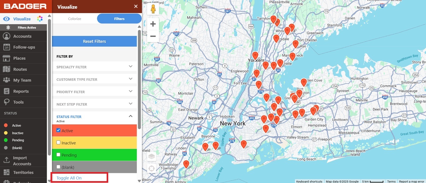
To do that, you’d have to go to Visualize, click Filters, look for Status Filter, click on Toggle All Off, and just check the Active box. This action will only show the accounts with Active status.

Click Toggle All On to bring all of the accounts back on the map.


1. Prepare a new spreadsheet and add a new column beside your current headers. Make sure that your new file follows the format of your original spreadsheet. Then label the new column on how you want to be able to filter them. If you want to filter them based on status, then name that column as “Status.”


2. The next step that you need to do is to label each account accordingly. As you can see on the picture below, the customers were labelled as Active and Inactive under the Status field.

3. Repeat the first two steps for any additional fields.
4. Once done, save your file and reimport it in Badger.
5. After importing, go to Visualize, click Colorize, and choose Status to color code the pins based on their status. You’ll see on the example that the pins for Active customers are in red while the Inactive ones are in yellow.

6. Click Filters if you want to see a particular set of clients. For example, you only like to just see the Inactive customers on the map. To do that, click on Toggle All Off, and just check the Inactive box. This action will only show the accounts with Inactive status.

Go ahead and click Toggle All On to bring all the accounts back on the map.


The video below shows you how to use visualization tools to colorize and filter your accounts on the map on your computer.
Looking for our logo?
Grab a Zip packed with our logo in PNG and EPS formats.